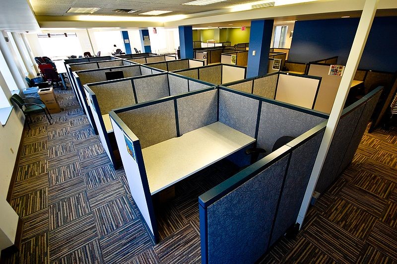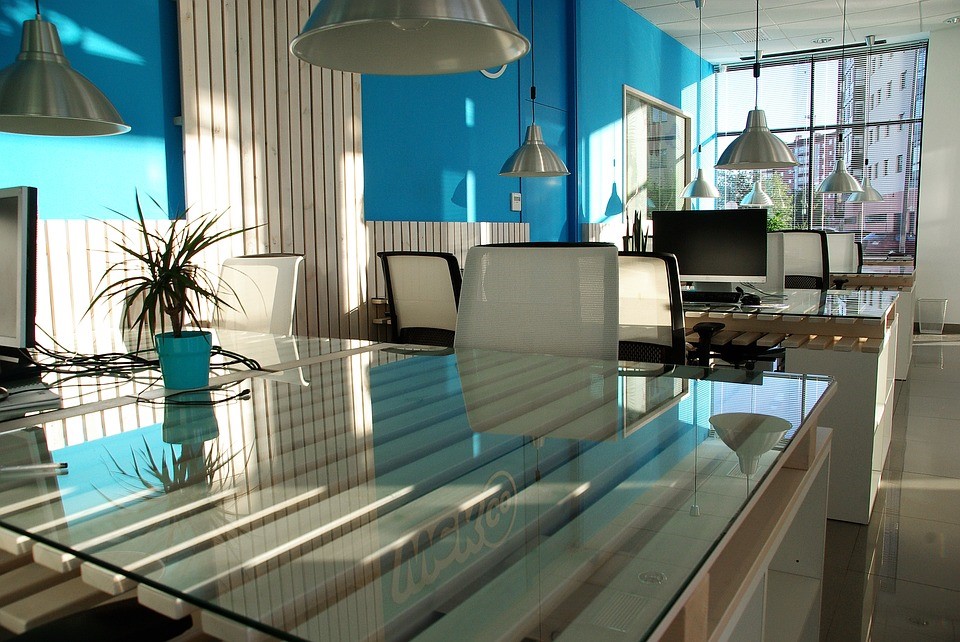
Colour is a vital part of creating the atmosphere in any room. This includes professional environments, where it could even affect workplace productivity. Being careful with your choice of paint is one simple way in which you may be able to improve staff performance.
There is plenty of scientific research into the impact different colours can have on the brain, so let’s look at how you can use specific colours for the desired impact. If you want more advice, you can always visit some office fit out companies that specialise in turning your vision into reality.
Red
Red is one of the fiercer colours and can be associated with anger; however, it is also a colour of strength and passion. Once used in warrior environments, it could help to encourage staff with tasks that require physical exertion.
Blue
In contrast to red, blue is calming and intellectual. Common associations include logic and efficiency. This is the colour to help your staff focus when facing particular mental challenges.
Yellow
Yellow can add immediate brightness and cheer to a room. If you want to stimulate a positive, creative environment, yellow can be the best choice. This is the colour of the sun, bringing the warmth of summer days.
Orange
Somewhere between red and yellow is warming, comforting orange. It is popular in kitchens and other areas involving food. Orange can also be bright and cheerful, adding a playful note to a more casual office.
Green
There is no colour more natural than green. The eyes do not need to adjust to it as the light changes throughout the day, making it ideal for offices in which employees work long hours. It is also a balanced and restorative colour, making it popular in medical establishments.
Purple
You do not want to overdo the purple. Just a small touch can add a luxurious, regal touch to a room; however, too much can be overwhelming. It is a rich, spiritual colour.
If you are finding it hard to decide, office fit out companies can help you to decide on the best balance of colour for your office.
Grey
Grey is another colour that needs to be carefully balanced. When used properly, it is a neutral shade that brings modernity to an office; when overdone, it can make an area dreary and uninspiring.


